More and more companies are including behavioural insights in their website design due to its benefits in enticing their users. In this blog I will discuss two examples of how behavioural knowledge can be applied to influence customers’ decisions on websites.
The power of defaults
People are driven by behavioural inertia – they prefer sticking to the current state of affairs over making a change. Neuroeconomics explains this phenomenon. By showing that conducting an action is always associated with an implicit cost, regardless of the outcome. To put it simply, doing something is always more effort than doing nothing.
For this reason, setting the desired option as the default would increase the likelihood of people choosing this option. The classic example of this is the difference between organ donation consent rates between countries. In countries where there is an opt-in consent system, the donation rates are much lower than in countries with an opt-out system.
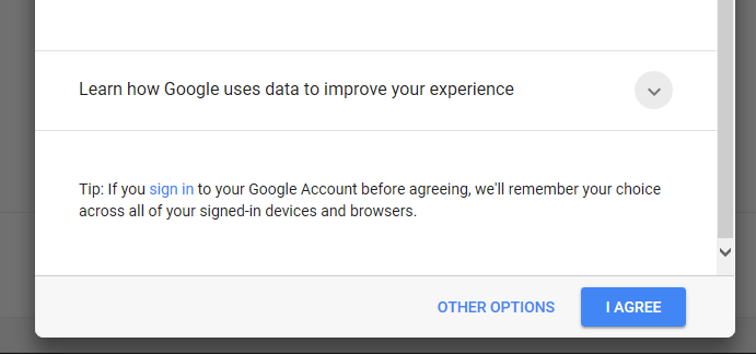
This principle can be applied to website design wherever we present customers with a choice. The options we want customers to choose can be pre-selected or visible in a drop-down list as default. This behavioural insight can be implemented by things such as asking users for consent, and the “agree” button can be made more prominent while other options hidden away. Any signal of a given option being the default will increase the probability of it being chosen. We can see below how this insight is used by Google when it asks users for consent to setting advertising trackers. The “I agree” button is signalled as default by using the contrast effect (bright blue colour over grey background).
Conversely, the alternative “other options” is blended into the grey background, which decreases its perceptual saliency. This decreases the probability of this choice being processed by the visual system and selected. In addition, the plural number of the alternative choice introduces a signal of higher effort. We are instinctively driven towards simplicity and effort minimisation (“I agree”) rather than having to choose between multiple options (a phenomenon known as decision avoidance).

Choice architecture
The behavioural insight around the power of defaults can be complemented with broader choice architecture. The classic example of this effect comes from the Economist study whose subscriptions included three options: online for $59, print for $125 and both print and online for also $125. We can immediately see that the last option looks strikingly attractive because we get both print and online versions for the same price as only the print version. In fact, 84% of people choose this option. If, however, we remove the print option and leave only the online or print & online options, only 32% of customers prefer it because the attractiveness effect no longer exists. This shows how choice architecture can nudge people towards selecting options generating more income.
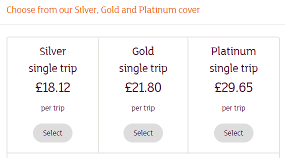
Let us now analyse choice architecture possibilities on the examples below. The first example is taken from Sainsbury’s insurance. We can see here that the difference between the silver and gold option is small, but the difference between both of them and the platinum option is high. This set up increases the perceived value of the gold option and biases people towards selecting it. Moreover, people are also likely to select the mid-point option independently of what exactly is on offer. We can, therefore, pre-empty the risk of most people going for the cheapest option by designing architecture which facilitates the choice of higher-priced option.
Another insight here is three as the magic number. A selection of three items is optimal; it is varied enough to provide a real choice, but not complex enough to generate too many opportunity costs (the perceived costs of not selecting a given option). It then allows us to embed framing effects into the available options.
Too many options produce the choice paradox – if there are more options on offer, the harder it is to make a choice, and can cause us not to make any choice at all.

By implementing behavioural biases into website design we are able to improve overall user experience. In this blog I have only touched upon two behavioural biases, choice architecture and the power of defaults, however there are many more insights we can use when designing a website which will influence a certain type of behaviour from its users, whether that be encouraging the user to pick a certain subscription through the use of choice architecture or utilizing default options on your website.


